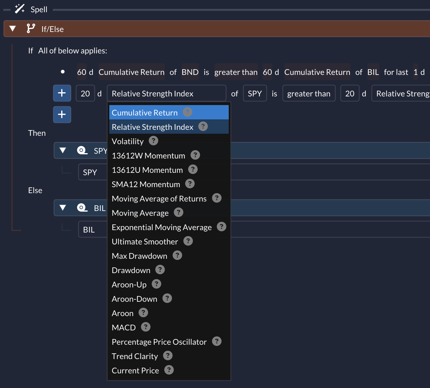
Indicators
Technical indicators are the inputs used by many QuantMage incantations, including If/Else, Switch, Enter/Exit, Mixed, and Filtered. This page summarizes the available indicators and how to interpret them.
Cumulative Return
Section titled “Cumulative Return”This is the percentage return of an asset over a specific period. For example, the 1-day cumulative return of SPY is calculated as (Today's Price of SPY / Yesterday's Price of SPY - 1) x 100. Here, and in most other indicators, QuantMage typically uses daily closing prices.
Relative Strength Index
Section titled “Relative Strength Index”RSI measures the momentum of price changes and is commonly used to identify overbought or oversold conditions.
Basics
Section titled “Basics”- Range: RSI ranges from 0 to 100. Traditionally, values above 70 signal overbought conditions, while values below 30 suggest oversold conditions.
- Formula: The formula for RSI is:
Here,RSI = 100 - 100 / (1 + RS)
RS(Relative Strength) is the average ofndays’ up closes divided by the average ofndays’ down closes. The average used is an exponential moving average.
Interpretation
Section titled “Interpretation”- Overbought/Oversold: As mentioned, levels above 70 might indicate a potential price pullback, while levels below 30 suggest a potential price bounce.
- Divergence: If an asset’s price hits a new high or low, but the RSI doesn’t follow suit, it’s a divergence. This can be a sign of a potential price reversal.
As with any indicator, RSI is best used alongside other indicators and analysis methods.
Volatility
Section titled “Volatility”Volatility measures the magnitude of an asset’s price fluctuations. In QuantMage, it is defined as the standard deviation of returns. QuantMage also uses its inverse for weighting in Weighted and Filtered.
13612W Momentum
Section titled “13612W Momentum”This indicator measures momentum over roughly one year using 1-month, 3-month, 6-month, and 12-month returns. More recent returns receive higher weight, which makes the signal more responsive:
(12 x (P0 / P1 - 1) + 4 x (P0 / P3 - 1) + 2 x (P0 / P6 - 1) + (P0 / P12 - 1)) / 19Where Pn is the price n months ago. A value greater than zero indicates a bullish momentum.
13612U Momentum
Section titled “13612U Momentum”This indicator is similar to 13612W, but it uses an unweighted average and therefore produces a slower signal:
((P0 / P1 - 1) + (P0 / P3 - 1) + (P0 / P6 - 1) + (P0 / P12 - 1)) / 4Where Pn is the price n months ago. Again, a value greater than zero hints at a bullish momentum.
SMA12 Momentum
Section titled “SMA12 Momentum”This provides another relative momentum signal over roughly one year. It is the slowest-moving of the three momentum indicators listed here:
13 x P0 / (P0 + P1 + ... + P12) - 1Where Pn is the price n months ago.
Moving Average of Returns
Section titled “Moving Average of Returns”This is the arithmetic mean of daily returns over a specific period.
Moving Average
Section titled “Moving Average”This is the simple average of an asset’s daily close prices over a specific period.
Exponential Moving Average
Section titled “Exponential Moving Average”This is a moving average that gives more weight to recent prices, making it more responsive to current market conditions. The weights for an n-day EMA are applied as follows:
W = 2 / (n + 1)EMA = previous EMA x (1 - W) + current Price x WUltimate Smoother
Section titled “Ultimate Smoother”Unlike EMA, which is a simple first-order smoothing filter, the Ultimate Smoother, developed by John Ehlers, subtracts the response of a high-pass filter from the input data to reduce lag. The result is a timelier signal with a slight trade-off in smoothness.
Max Drawdown
Section titled “Max Drawdown”This measures the largest drop from a peak to a trough over a set period, helping you gauge the risk of an asset or strategy.
Drawdown
Section titled “Drawdown”This measures the percentage drop from the all-time peak to the current price. You can combine it with a subspell to build a trailing stop-loss rule.
Aroon-Up / Aroon-Down / Aroon
Section titled “Aroon-Up / Aroon-Down / Aroon”Aroon was developed by Tushar Chande in 1995 to identify trend strength and direction.
Components
Section titled “Components”The Aroon indicator consists of two separate lines:
- Aroon-Up: Measures the strength of the uptrend.
- Aroon-Down: Measures the strength of the downtrend.
Calculation
Section titled “Calculation”It is based on the number of periods since the highest high and the lowest low over a predefined period, commonly 25 days.
Aroon-Up = ((n - Days Since n-day High) / n) x 100Aroon-Down = ((n - Days Since n-day Low) / n) x 100Interpretation
Section titled “Interpretation”Aroon-Up and Aroon-Down are percentage indicators that measure how recently the n-day high or low occurred. QuantMage also provides the Aroon Oscillator, which is calculated by subtracting Aroon-Down from Aroon-Up. The oscillator ranges from -100 to 100, with zero as the centerline. Positive values indicate an upward trend, while negative values suggest a downward trend. These are the only indicators on this page that use daily high and low prices instead of daily close prices.
The MACD (Moving Average Convergence Divergence) histogram is a momentum indicator based on the relationship between two exponential moving averages.
Components
Section titled “Components”- MACD Line: Calculated by subtracting a 26-day Exponential Moving Average (EMA) from a 12-day EMA.
- Signal Line: A 9-day EMA of the MACD line.
- MACD Histogram: Represents the difference between the MACD line and the signal line.
Interpretation
Section titled “Interpretation”- Above Zero: When the histogram is above the zero line, it indicates that the MACD line is above the signal line, which can be a bullish sign.
- Below Zero: When the histogram is below the zero line, it suggests that the MACD line is below the signal line, which can be a bearish sign.
As with other technical indicators, MACD is best used alongside other tools and methods.
Percentage Price Oscillator
Section titled “Percentage Price Oscillator”The Percentage Price Oscillator (PPO) is a momentum indicator that expresses the difference between two moving averages as a percentage. Like MACD, it is based on moving-average divergence, but it is normalized by price level, which makes cross-security comparisons easier.
Components
Section titled “Components”- PPO Line: Represents the difference between a 12-day EMA and a 26-day EMA, expressed as a percentage:
(12-day EMA - 26-day EMA) / 26-day EMA x 100
- Signal Line: A moving average (typically a 9-day EMA) of the PPO line.
- PPO Histogram: Represents the difference between the PPO line and the signal line.
Interpretation
Section titled “Interpretation”The indicator outputs histogram values. Positive values indicate bullish momentum, while negative values indicate bearish momentum.
The PPO histogram provides a normalized measure of the difference between two moving averages, allowing easier comparisons across different securities or timeframes.
Trend Clarity
Section titled “Trend Clarity”Trend Clarity measures how pronounced a trend is by calculating the R-squared value, or coefficient of determination, of a simple linear regression on price data.
Interpretation
Section titled “Interpretation”- 100% Clarity means the price data forms a perfect line, indicating a very clear trend.
- The farther each price point deviates from the approximate (i.e. regressed) line, the lower the Trend Clarity score gets.
- 0% suggests that the line is no better in approximating the data than simply using the average price for the period.
This metric helps you gauge trend strength and assess whether the move is likely to continue or revert. For more detail, see this article.
Current Price
Section titled “Current Price”This is the asset’s current price. It is often compared with moving averages to identify trends.
These indicators provide the core inputs for many QuantMage strategies and conditions.
Further Resources
Section titled “Further Resources”For those eager to delve deeper into the world of technical indicators, here are some resources: